

Neighbourhoods in England that are home to the most minority-ethnic people are 15 times more likely to face extreme heat than the least diverse areas, according to Carbon Brief analysis.
People with the lowest carbon footprints – who therefore contribute less to climate change – are also more likely to live in areas that experience high temperatures.
This is based on Carbon Brief analysis that combines satellite data on heat exposure with data on per-capita emissions, ethnicity and levels of deprivation across England.
Thousands of deaths in the UK have been attributed to heat in recent years and the threat is expected to grow as climate change worsens.
But heat is also felt differently across the country, with certain groups both more exposed and more vulnerable to dangerous temperatures.
Broadly, the analysis shows how those subject to the “urban heat island” effect in English cities, often in low-quality housing and with little access to green space, are more likely to experience extreme heat.
Experts tell Carbon Brief that policymaking should reflect the reality of climate change “amplifying” inequalities across society and provide help to those most in need, such as more heat-resilient social housing.
Heat threat
As greenhouse gas emissions and global temperatures rise, more people in the UK are likely to become ill or even die due to extreme heat.
Heat has killed around 6,000 people in England over the past three years, according to government figures. This is roughly double the number killed over the same period between 2016 and 2018.
Scientists have repeatedly linked extreme heat – and the resulting deaths – to climate change.
In June 2025 alone, more than 260 people died in London due to a heatwave, according to a recent attribution study that linked the event to climate change.
Government advisor the Climate Change Committee (CCC) estimates that the number of heat-related fatalities in the UK each year is set to triple by 2050, without adaptation measures.
Around half of homes in the country are already at risk of overheating and the CCC expects this to reach 90%, if global temperatures rise by 2C above pre-industrial levels.
However, these risks will not fall equally across society, with children, the elderly and disabled people more vulnerable to heat-related illness. There is also evidence that poorer communities and people of colour are more vulnerable to extreme heat.
Such communities also tend to have lower carbon footprints than those that are whiter and wealthier.
This fits with the broader concept of climate justice, which describes how people who are least responsible for climate change often end up bearing the brunt of its effects.
Carbon footprints
To investigate these issues, Carbon Brief combined detailed satellite data on heat exposure across England, provided by 4 Earth Intelligence, with neighbourhood-level carbon footprints compiled by the Centre for Research in Energy Demand Solutions (CREDS).
The CREDS dataset provides estimates of per-person carbon footprints, indicating how much the average person in each neighbourhood is contributing to climate change.
Due to data availability, this analysis focuses exclusively on England, the nation that experiences the most extreme heat in the UK.
Every neighbourhood is scored based on its “heat hazard”, meaning the likelihood that it will experience higher relative temperatures during hot weather, compared to surrounding areas.
The analysis then zooms in on the 10% worst-affected neighbourhoods in England. These neighbourhoods have a heat hazard score of 4 or 5, meaning that they face higher exposure to heat than 90% of areas around the country. (For a full explanation, see Methodology.)
The figure below shows that neighbourhoods with lower carbon footprints are twice as likely to face high heat hazard scores than areas with higher carbon footprints.
Specifically, it shows that 13.4% of neighbourhoods with the lowest carbon footprints are among the English areas most exposed to heat hazards. In contrast, only 7.0% of neighbourhoods with the highest carbon footprint are among the most heat-exposed areas.
Neighbourhoods in England with lower carbon footprints are often in dense, urban areas, where people tend to be less reliant on cars and more likely to live in energy-efficient flats.
Areas with higher carbon footprints are commonly found in rural areas, where travelling by car can be a necessity due to limited public transport.
Also, particularly in south-east England, people in these rural neighbourhoods are often wealthier, meaning they spend more money on flights and other high-emitting luxuries.
Ethnicity and deprivation
Carbon Brief also analysed the heat threat facing deprived neighbourhoods in England and those that are home to more people of colour.
Information about how many people identify as black, Asian and other minority ethnicities in each neighbourhood is based on 2021 census data, via the Office for National Statistics.
As the chart below shows, there is a clear correlation between the number of people of colour living in a neighbourhood and the likelihood of it facing extreme heat during periods of hot weather.
The most ethnically diverse neighbourhoods – where roughly half or more of the population are people of colour – are 15 times more likely to have high heat hazard scores than the least ethnically diverse neighbourhoods, where almost everyone is white.

Among the most diverse areas are parts of Newham in east London, Saltley in Birmingham and Spinney Hills in Leicester, all of which are inner-city areas.
The least diverse neighbourhoods range from coastal parts of Redcar and Cleveland in North Yorkshire to the rural villages of south Somerset. None of England’s hottest 1% of neighbourhoods are in this bracket.
Additionally, Carbon Brief assessed the relationship between levels of poverty and heat risk, based on England’s indices of deprivation dataset. This covers several measures of deprivation, including income, employment and health.
People living in the most deprived English neighbourhoods are more than three times as likely to face high levels of heat hazard as those in the least deprived neighbourhoods, as shown in the figure below.
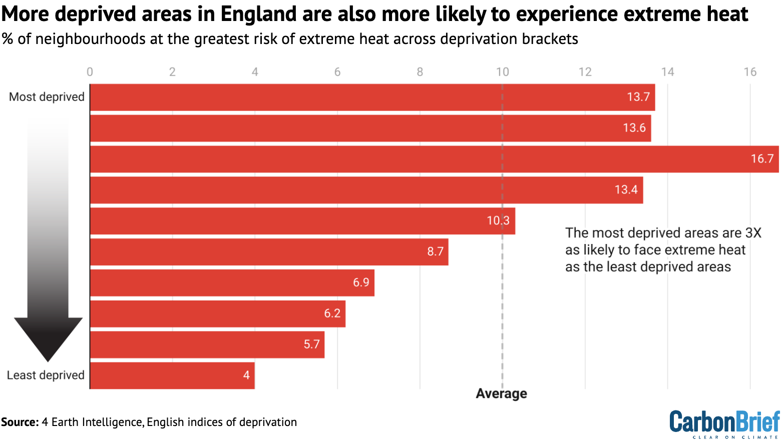
The correlation between poverty and extreme heat is less extreme than the one between heat exposure and ethnicity.
While many of England’s most deprived areas are in cities, they are also clustered in some rural and coastal areas – such as parts of Cornwall and Lincolnshire – which tend to be cooler.
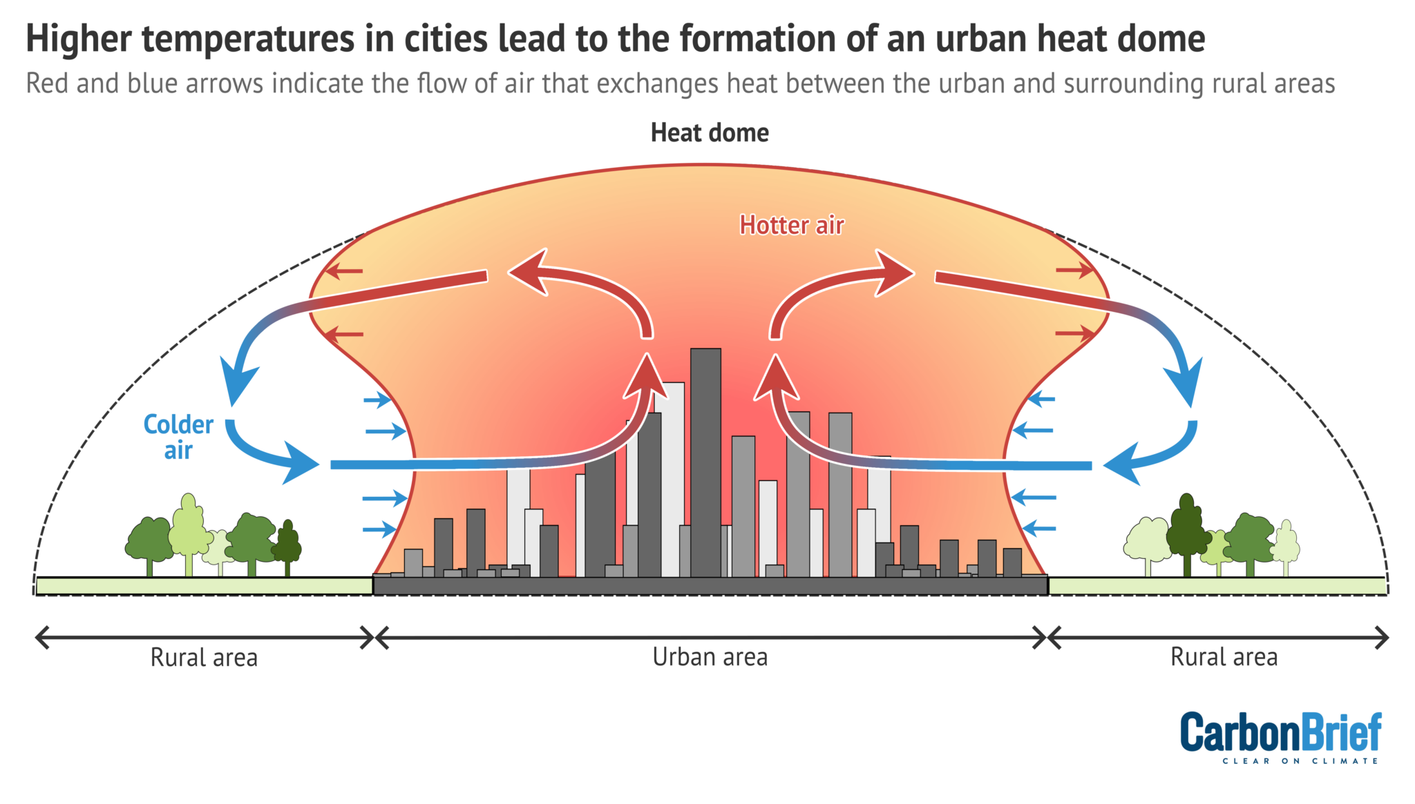
Urban heat island
The key phenomenon captured by this analysis is the urban heat island effect. This describes how cities – and particularly areas with dense buildings, roads and stretches of concrete that absorb heat – tend to be hotter than the surrounding countryside.
Cities such as London, Manchester and Birmingham have reached temperatures up to 5C hotter than the surrounding areas in recent decades, due to this effect.
The diagram below shows how air flows circulate between rural and urban areas, forming “heat domes” over cities.
Inner-city areas in England are also home to many people facing high levels of deprivation, as well as large black and Asian communities. Many of these communities are therefore exposed to more dangerous temperatures due to the urban heat island effect.
Access to green spaces, even within cities, also influences exposure to the urban heat island effect. Research has shown how people in deprived areas and people of colour – particularly black people – are more likely to live in areas with less access to green spaces.
There is already extensive scientific literature that uses satellite data to demonstrate the urban heat island effect in cities and other locations.
A number of studies have also used this data to show how people of colour and those living in poverty are more exposed to extreme heat. Much of this research has come from the US, where historic housing inequalities have created stark patterns of segregation in many cities.
A project led by environmental policy researcher Dr Angel Hsu of the University of North Carolina-Chapel Hill shows how, globally, “cities are burdening lower-income populations with higher heat exposure”, as she tells Carbon Brief.
Given this, Hsu adds that “it’s not surprising to us to see similar disproportionate exposure patterns among UK neighbourhoods”.
Other researchers tell Carbon Brief that it is important to be wary of satellite data, as it does not precisely capture the air temperatures experienced in these neighbourhoods.
Dr Charles Simpson, who researches the health and economic impacts of climate change at University College London (UCL), notes:
“Satellite-measured surface temperature does not always correlate with the air temperature – what you are measuring includes a lot of road surfaces and rooftops. The air temperature is thought to be more directly relevant to people’s health and their cooling needs.”
Previous research has found that satellite data can therefore overestimate the urban heat island effect compared to data from weather stations.
These stations, however, are not widespread enough to allow comparisons with detailed neighbourhood data. They are particularly lacking in more deprived areas in England, potentially making measurements there less reliable.
Other scientists tell Carbon Brief that, in the absence of a comprehensive ground monitoring network, satellite measurements can serve as a stand-in to estimate heat exposure. Dr Chloe Brimicombe, an extreme-heat researcher based at the University of Graz, explains:
“Although it’s not a good indicator of perceived [temperature], it is a good indicator of what regions are most built up and have the environments that are most vulnerable to heat.”
‘Amplifying’ inequalities
There is a growing body of evidence gathered by activists, scientists and local governments around the UK revealing the unequal burden of climate change.
Dr Charles Ogunbode, an assistant professor of applied psychology at the University of Nottingham who specialises in how people experience climate change, tells Carbon Brief that this kind of data helps to clarify the links between climate change and inequalities:
“We can’t avoid dealing with the issue of social inequalities and climate change is just basically amplifying those things. It’s highlighting them, it’s revealing them. So whatever policies we put in place – be it in the health sector, be it in the climate sector – addressing those inequalities has to be an essential part of whatever those responses are.”
There are many factors influencing how people experience heat that are not captured in Carbon Brief’s analysis.
Previous work by researchers at the University of Manchester and Friends of the Earth has explored this issue, including an analysis of more than 40 indicators that could make neighbourhoods more “socially vulnerable” to heat.
This reveals similar outcomes, with people of colour and those contributing the least to climate change generally more vulnerable to its impacts.
One of the biggest factors that contributes to people’s exposure to heat extremes in the UK is the country’s housing stock, which is “not fit for the future”, according to the CCC.
UK homes have generally not been built for hotter conditions and poorer people are more likely to live in badly adapted housing. Those living in small homes, flats and social housing in England all “suffer significantly more overheating” during heatwaves, according to one study.
Dr Giorgos Petrou, a researcher in building physics modelling at UCL, tells Carbon Brief that it is also vital to consider whether households have the ability to adapt to climate change. “Amongst other factors, their capability will depend on their financial means and whether they own or rent their home,” he says.
Experts tell Carbon Brief that the government should act across its policy agenda to not only address extreme heat, but also support those who are most affected by it. This could involve expanding tree cover and renovating old social housing stock in at-risk communities.
Emma Howard Boyd, a former chair of the Environment Agency who also chaired the London Climate Resilience Review, tells Carbon Brief:
“I do think that with [the Labour] government focusing on house building and retrofit, this is a fantastic opportunity to get this right…For those communities that have had the least impact on the environment and climate change themselves.”
Methodology
This analysis collates several datasets that cover England at a neighbourhood level, with “neighbourhoods” defined as lower-layer super output areas (LSOAs). These are small statistical areas used by the UK government, covering populations of about 1,500-3,000 people. There are 33,755 LSOAs in England.
Data on vulnerability to heat comes from 4 Earth Intelligence (4EI), which analyses land surface temperature to generate “heat hazard” information at a 30m resolution. This detailed information has been converted into LSOAs by 4EI.
Heat hazard scores are calculated by 4EI, based on the likelihood that a given neighbourhood will experience high temperatures during hot weather, relative to the surrounding area.
Each score corresponds to a different percentile of English neighbourhoods. The bar below shows the percentage breakdown across all LSOAs in England.
The two hottest scores – those coloured in red – correspond to the 10% of English neighbourhoods that have higher heat hazard scores than the remaining 90%.

For simplicity, Carbon Brief’s analysis focuses on the red bars above, meaning neighbourhoods in either the top 90th-99th percentile or 99th percentile of heat hazard. (Neighbourhoods in the 90th-99th percentile have higher heat hazard scores than 90% of areas in England. Neighbourhoods in the 99th percentile have higher heat hazard scores than 99% of areas.)
It shows how these two scores are overrepresented in LSOAs that have lower carbon footprints, more diverse communities and higher levels of deprivation.
Carbon-footprint data is from the CREDS “place-based carbon calculator”, which estimates the average per-person carbon footprint for every LSOA in England. It accounts for emissions-producing activities ranging from electricity use to “consumption of goods and services”.
CREDS assigns the grades “A” to “F” (low carbon footprint to high carbon footprint) to neighbourhoods. Carbon Brief has based its carbon-footprint analysis on these grades.
LSOA-level data on black, Asian and other minority-ethnic populations comes from 2021 census data. English LSOAs were broken down into deciles, based on the percentage of the population that identified as non-white ethnicities.
The lowest decile covered the tenth of LSOAs with between 0 and 2% non-white minority-ethnic populations and the highest covered the tenth with more than 51%.
England’s indices of multiple deprivation dataset also includes LSOA-level information. It provides relative measures of deprivation for LSOAs in England, based on income, employment, education, health, crime, living environment and barriers to housing and services. Carbon Brief broke the LSOAs down into deciles based on the total deprivation scores, from the most deprived to the least deprived.
Words by Josh Gabbatiss. Analysis by Verner Viisainen
Great Job Carbon Brief Staff & the Team @ Carbon Brief Source link for sharing this story.


